- Social Fuel Newsletter
- Posts
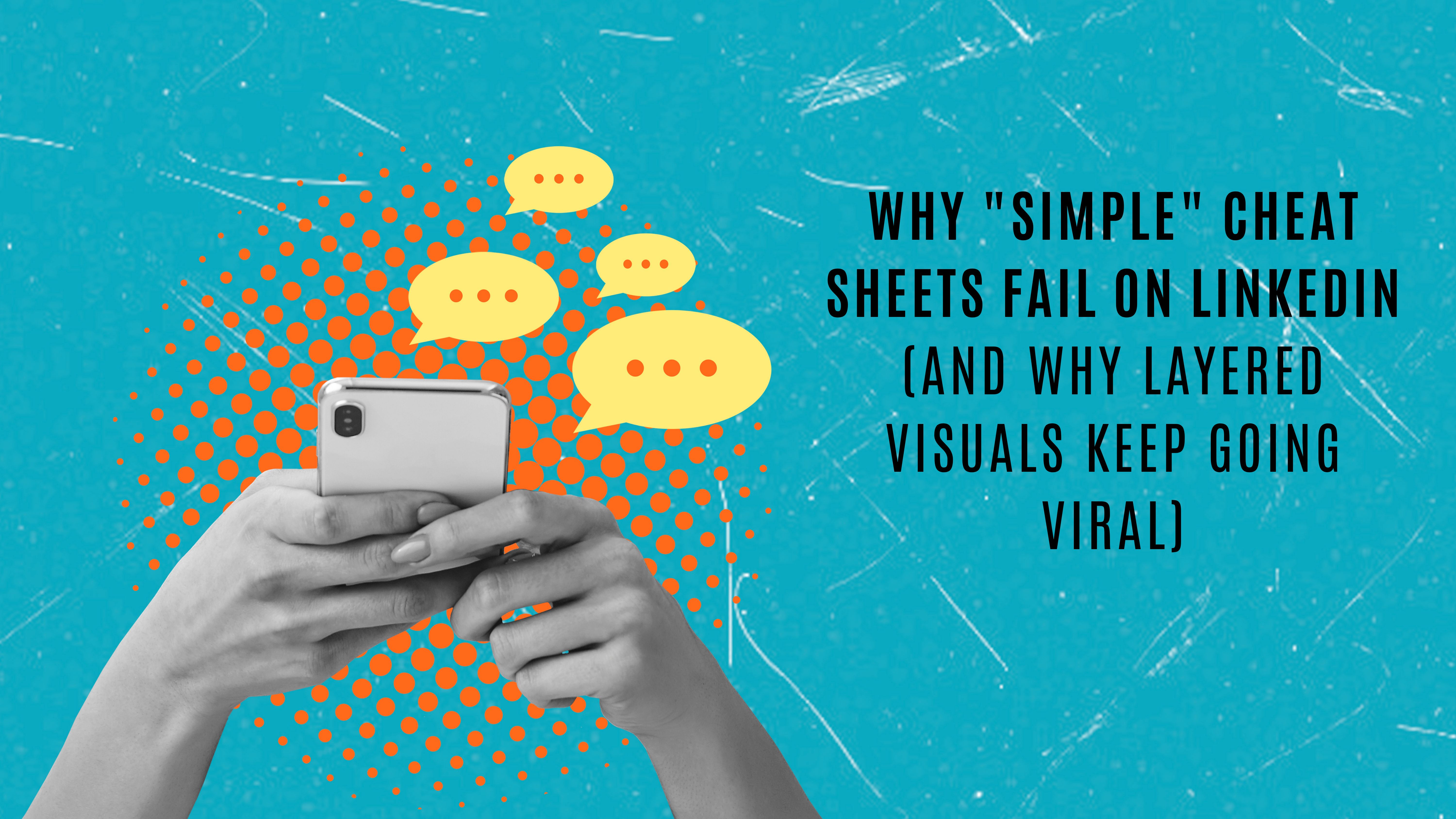
- Why "Simple" Cheat Sheets Fail on LinkedIn
Why "Simple" Cheat Sheets Fail on LinkedIn
(And Why Layered Visuals Keep Going Viral)
Kevin Box
March 22, 2026
Most creators think simple visuals perform best.
Clean. Minimal. Easy to scan.
It sounds right. It’s also why their posts flop. Because on LinkedIn, simple doesn’t win attention. Depth does.
LinkedIn doesn’t rank content the way most people think.
It doesn’t ask “Is this clean?”
It asks “Did this make someone stay?”
I wrote an entire chapter on this in Synergy. LinkedIn’s algorithm, built on their 360Brew system, has moved beyond counting clicks and likes. It reads your content. It evaluates whether your post delivers real value before it even starts distributing it.
But here’s what matters for visuals specifically. The algorithm optimizes for three things:
Dwell time. How long someone spends on your post. LinkedIn has used this as a ranking signal since 2020 and it’s gotten stronger every year. In 2026, it’s one of the most important quiet signals the algorithm tracks.
“See more” expansion rate. Whether people actually click to open your full post. If they don’t, the algorithm assumes your content wasn’t compelling enough.
Engagement quality. Not just likes. Comments that show thought. Saves. Shares. The algorithm now detects whether interactions are meaningful or shallow. Engagement bait gets flagged and deprioritized.
Here’s the key: layered visuals naturally increase all three.
Why Your “Layered” Cheat Sheet Wins
Your post works because it creates visual friction in a good way.
When someone sees a dense, multi-section cheat sheet in their feed, their brain says “There’s a lot here. I should explore this.”
So they pause. They zoom in on mobile. They swipe through the sections. They scan each box. They jump between elements.
That behavior does two things at once. It drives up dwell time. And it triggers active engagement signals like swiping through carousel slides, expanding the post, and spending measurably more seconds on the content.
LinkedIn sees all of that and says “This is valuable. Show it to more people.”
This is why document posts, the PDF carousel format, are crushing every other content type right now. The latest benchmarks show document posts averaging around a 7% engagement rate. That’s roughly 3x higher than video and nearly 6x higher than plain text posts.
Your layered cheat sheet is exactly the kind of content driving those numbers.
Why Flat, Single-Image Infographics Underperform (My Theory)
Now compare that to a single blended image.
It’s clean. Minimal. Easy to process.
And that’s the problem.
It’s also “flat” meaning as soon as someone sees it, they see it as a single image, so their eyes wonder all of the image, instead of start in the top and working down from left to right.
The brain processes it in a second. There’s nothing left to explore. No reason to stay. No sections to scan. No slides to swipe through. Nothing deeper to explore.
So the viewer says “Got it” and scrolls.
What the algorithm sees: minimal dwell time. No expansion. No depth of interaction. And when the algorithm doesn’t see those signals during the first 60 minutes of distribution, it doesn’t push the post further.
This isn’t algorithm suppression. It’s the natural consequence of giving the algorithm nothing to work with. Your post has to earn distribution. Flat images don’t give LinkedIn enough evidence that the content is worth showing to more people.
The Psychology Behind It
There’s real science here. It’s called information foraging theory.
Developed by Peter Pirolli and Stuart Card at PARC in the late 1990s, the theory draws a direct parallel between how animals forage for food and how humans seek information. The core idea is simple. People are constantly evaluating the ratio of value gained to effort expended. They move toward content that signals high information density and away from content that looks low yield.
What makes layered visuals work is what researchers call “information scent.” These are the cues that signal to a viewer “There’s valuable content here worth your time.” Sections, labels, visual structure, multiple entry points. All of these strengthen the scent.
A well-designed cheat sheet creates three things that align with how humans naturally forage for information:
Multiple patches of value. Each section of your cheat sheet is its own information “patch.” Viewers scan from patch to patch, extracting value as they go. The more patches, the longer they stay.
Strong information scent. Headers, labels, color-coded sections, and structured layouts all signal “There’s more here.” This is what pulls people in and keeps them exploring.
Reward loops. Every section they scan delivers a discrete insight. That micro-reward keeps them moving to the next section instead of scrolling away.
A flat image offers none of this. It delivers everything in one shot. There’s nothing left to forage. No scent to follow. No reason to linger.
And on a platform where 72% of activity happens on mobile and users spend roughly 7 seconds deciding whether to engage, that matters enormously.
The Real Insight Most Creators Miss
This isn’t about design only. It’s also about behavior engineering.
Layered content forces exploration. It extends attention. It gives the algorithm the signals it needs to justify wider distribution.
Flat content ends the interaction immediately.
And on LinkedIn, the math is straightforward. The longer someone stays on your post, the further it spreads. Not because the algorithm rewards “tricks.” But because 360Brew is designed to identify content that delivers genuine value. Extended attention is one of the strongest proxies it has.
This is also why expertise and topic authority matter so much now. The algorithm doesn’t just evaluate the post. It evaluates you. If your content history demonstrates consistent depth in a subject area, 360Brew gives your posts higher confidence when distributing them. A layered cheat sheet from someone who’s been posting about that topic for months carries more weight than the same visual from a random account.
The 4 Rules for High-Performing Visual Content
1. Design for exploration, not consumption.
If someone can understand your entire post in two seconds, you’ve already lost. The goal is to create content that rewards time spent. Sections. Layers. Multiple areas to scan. Give people a reason to stay.
2. Create multiple entry points.
Your visual should have sections, labels, and visual anchors. The eye should keep moving. On mobile, this means designing content that people swipe through and zoom into rather than glance at and scroll past.
3. Reward attention in layers.
Don’t give everything upfront. Let users discover value as they engage. Each section of your cheat sheet should deliver a discrete insight. This is what creates the “one more section” effect that drives dwell time.
4. Maximize meaningful interaction signals.
Before you post, ask yourself: Will someone swipe through this? Will they save it for later? Will they expand it to read the details? Will they spend 15 seconds or 60 seconds with this content?
If the answer is 60 seconds, it will perform.
The Shift That Changes Everything
Most creators optimize for “How do I make this look clean?”
Top creators optimize for “How do I make this impossible to ignore and hard to leave?”
Because the goal isn’t simplicity. It’s sustained attention combined with genuine value.
LinkedIn’s algorithm isn’t trying to reward visual tricks. It’s trying to surface content that helps professionals learn, grow, and make better decisions. But the mechanism it uses to identify that content relies heavily on behavioral signals. Dwell time. Engagement depth. Completion rates on carousels.
Layered visuals win because they naturally produce the exact signals the algorithm is looking for.
Final Thought
Your viral post didn’t succeed despite being dense.
It succeeded because of it.
Because in a feed designed for speed, the winners are the ones who slow people down and make it worth their while.
Before your next post, ask yourself one question: “Does this invite exploration or end it?”
That single shift in thinking will change how your content performs.
Kevin Box is the author of Synergy: Thought Leadership, Strategic Partnerships, and Your LinkedIn Brand Engine. Connect with him on LinkedIn.

Free LinkedIn Growth Workshop
📌 I'm hosting a free 1.5-hour workshop on April 4th at 9:30 AM Central Standard Time on the 5 Secrets to Growing Your Personal Brand and Monetizing your Digital Business.
Everyone who signs up and attends will receive 2 Free Gifts valued at $89.
𝗖𝗹𝗶𝗰𝗸 𝗵𝗲𝗿𝗲 𝘁𝗼 𝗿𝗲𝗴𝗶𝘀𝘁𝗲𝗿 𝗳𝗼𝗿 𝘁𝗵𝗲 𝘄𝗼𝗿𝗸𝘀𝗵𝗼𝗽:
Reply